Organic Organization Chart: Autodesk's New View of Organisational Structure

A researcher at 3D design software firm, Autodesk is championing a new way of visualising how organisations change and evolve using a company's internal graph.
James Mayes, investigated the Autodesk experiment, chatted to the man behind it and discovered a fantastic offer for those wanting to run the same experiment for their organisation.
I was lucky enough to attend the Chinwag Psych event last week – a new event bringing together psychology, neuroscience, web usability, big data and much else besides.
I can’t recommend it highly enough and I’ll be sharing more of my thoughts soon. For now, I wanted to share this video from the day. It’s a piece of work from the research labs at Autodesk. This is what happens if you take your organisational chart and bring it to life.
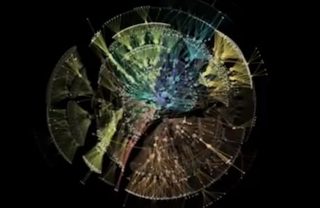
Autodesk call it the Organic Organization Chart – to me, it feels like the combination of company data and time-lapse photography. However you describe it, it seems both beautiful and full of insight – a new, more realistic view of organisational structure. It prompts me to ask questions about the organisation, offers pointers I might otherwise not have noticed.
How does the influence move around the organisation? Why is a particular team so cut off? How did that acquisition become so quickly integrated? I wonder how many other organisations have the ability to produce something like this – and if they could, whether they’d share?
In his follow-up post, James continued:
Last week I wrote about a research project from Autodesk, where the research labs are looking at visualising organisational change. The original post can be seen here, along with the visual version of Autodesk’s own personnel changes.
I’m pleased to report the scientist behind the project contacted me in response to the post and has offered to create a similar video for others – an organic organisational chart, if you will.
In his words:
"Each day the entire hierarchy of the company is constructed as a tree with each employee represented by a circle, and a line connecting each employee with his or her manager. Larger circles represent managers with more employees working under them. The tree is then laid out using a force-directed layout algorithm. From day to day, there are three types of changes that are possible:
- Employees join the company
- Employees leave the company
- Employees change managers
Instead of recomputing the full layout each day, we animate the transitions from one day to the next."
So why offer to do this for others? Again, Justin explains for me:
"I wasn’t sure what to expect, but the biggest revelation for me has been just the total amount of activity going on. You can see the day counter in the top left, and there is stuff going on almost every single day. In your own little corner of the company, you hear about some org changes going on, but typically most people have no idea about the total amount of activity.
It would be really great to compare what we see in the Autodesk example, with what is going on in other companies. Maybe they have more or less activity? Maybe they have a deeper or flatter hierarchy? Maybe other companies have more isolated “activity periods”? I think it could be really interesting."
In order to produce the video, data is obviously required. To make this as easy as possible, what’s needed is simply the manager name / employee name / date stamp. Privacy is obviously important – so the work can easily be done anonymously using employee/payroll numbers instead of actual names – and nothing at all will be visible on the final video (as the Autodesk example shows).
If this format is a problem, Justin may still be able to do so something – please do step up and ask. The key aspects are when employees join, move or leave – Justin has the ability to do a certain amount of work to reshape data, depending on what you can provide!
Final thoughts from Justin:
"There would be no charge for this, but it is part of a research project, so I would ideally like to publicly release the resulting animation. It could be released without disclosing the company name if that made things easier. If releasing the results is really not an option, I might still be interested in creating the visualization for the organization’s internal-only viewing, but that would be less ideal."
If you’re interested in discussing directly with Autodesk, just leave a comment [on James' blog] or contact me by any of these means. I’ll intro you to Justin and leave you to enjoy a visual journey of discovery!
Originally published in two posts on James' Musings from Sussex blog: here and here. Republished with permission.


21 May 2013 by Sam Michel

Sam Michel is the founder of Chinwag and blogs here for work, and more randomly at Toodlepip. He runs Chinwag Jobs, Digital Mission and tends to focus on murky place where technology, community and marketing collide. You'll find him on twitter @toodlepip.
Sam Michel is the founder of Chinwag and blogs here for work, and more randomly at Toodlepip. He runs Chinwag Jobs, Digital Mission and tends to focus on murky place where technology, community and marketing collide. You'll find him on twitter @toodlepip.